• Work
  • Film
  • Journal
  • Sketchbook
  • Profile
Baylor Watts Creative
  • Work
  • Film
  • Journal
  • Sketchbook
  • Profile

Multimedia Ethnography // Mid-term Portfolio

Baylor Watts


Section 1: Reading Notes

Week 1: The Multimodal Turn

After reading these articles, I think that multimodal anthropology is actually what comes naturally to me. I wasn’t even really aware that this was a possibility when I started this program, but I have to say, it makes me more confident about finding a space where I can exist as an anthropologist and an artist. 

I love to write, but my writing has fallen off as I learned I love to create visual and aural scenes. I find great meaning and comfort in soundscapes, and when I record them I do sometimes feel that I’m capturing the essence of a place. Photography gives me a similar feeling. I have learned to enjoy recording my own voice. Sometimes I make diary entries this way because as technology proliferates, I find it easier than writing on paper or in a word processor. And I really want to improve as a videographer and video editor. I’m glad to hear in these articles that anthropologists are accepting more media into the discipline, because while I want to be a serious anthropologist, I have gotten the feeling for the last couple years that I would rather make art of some kind that reflects my anthropological viewpoints. I want to theorize, but I tend to theorize out loud, in conversation with particular friends who bring it out in me, like in a podcast. This is why I love the way they talk about editing and care in “Last but not least.” Being careful not to edit someone’s thoughts into your own, but spiraling toward insights together, driving each other. And I love, too, their notion that multimodal ethnography should resist definition because it’s about experimentation. I have been thinking about this a lot. My current inspirations for how I would like to convey the ethnographic insights I gather are somewhere between old talk shows, long form storytelling podcasts, plays and films like August: Osage County, and the style of an old American show called CBS Sunday Morning, which would come on every Sunday and feature about 5 human interest stories before signing off with a long soundscape/videoscape from somewhere in nature. I love the way that grounded my Sundays in something peaceful. I love also collaborative volumes and zines, and I’m inspired by the idea of working with others to make anthropological work. 


Week 2: Image

“Revealing images arise when one's awareness and understanding align with some brief visual manifestation of the social world” (Sutherland 2016, 38). 

Yes! The right moment for a photo is all about timing and subjectivity. I like what Sutherland says about the anthropologist being somewhat of an artist, combining the tangible and the symbolic in frame. I think of Edward Said’s “Orientalism”, and Lila Abu Lughod’s piece in “Media Worlds,” as Sutherland talks briefly about the tension between image and captions, and the decision to explain or not. Do you leave the interpretation up to the viewer? Or is it the responsibility of an anthropologist to explain, or invoke a question that brings the viewer to an understanding, without tempting them to romanticise or exoticise the imagery. His pictures are quite lovely. They do have a very real quality to them; they feel at times private, funny, random, and all beautifully composed. I mean there should be a little room in documentary for pure aesthetics, right?

Sarah Pink’s chapter on photography starts with another perfect insight. It is the viewer who decides what imagery is anthropologically relevant (Pink 2013, 74). Any picture has the chance to document something for someone. But you know, now that we have our phones all the time, and thus have a really good camera for capturing moments, what will happen to composition? 

I love Pink’s description of Dawn Lyon and Peter Hatton’s ‘strategies of looking.’ It sounds like a photographic meditation, the way they suggest “not trying too hard to see everything but to absorb the sensory feel and activity of the space, and taking photographs as part of that process” (78). I want to be in photographic flow state. There are times I have been, while trying to document an event ethnographically. But it was a tough balance of being ‘there’ as an anthropologist, and being behind the camera as a photographer. I have many more meaningful pictures of environments, because I find them much easier to capture. I love things that stand still and let me behold them. 


Week 2: Image

An Van Dienderen’s film is sort of unlike anything I’ve ever seen. Combined with her article she has made a total research art piece. I read the article first so I would have proper context watching the film, and I really liked her approach. I had heard before that early film, both black and white and color, had been balanced in order for white skin tones to show up, and people of color were, as she puts it, “positioned in relation to” the invisible norm of whiteness. 
I didn’t know about the china girls, an aspect of early television production that just makes the whole process a bit sleazier. I liked how the film was really shot on film, and shot to emulate the 1970s. I thought aesthetically it made its point, without being too full of unnecessary imagery. Van Dienderen talked about struggling to edit, and eventually only putting in shots she liked intuitively, ones that didn’t force a narrative. The disembodied CEO’s voice was a good touch. I do wish there was some aspect of the film that showed more of how this “china girls” practice influenced filmmaking today or how it’s still used today. On the other hand, it did make me think a lot about Moonlight, a film I watched for the first time earlier this week. That film has no white characters and almost seems like an inverse color experiment, to see how many nuanced colors they can achieve with black skin. They play with blue tones, green and pink tones, and warm streetlight tones, showcasing Florida’s colorful personality and balancing the legacy of chromakeying by being absolutely loving and meticulous with black skin tones. It’s a gorgeous film, both visually and in content, and I’m already viewing it in a new light. 


Week 3: Sound

I have to say, as someone who loves music and podcasts, and who has made both myself, I've paid very little mind to sonic ethnography before now. This article was a really nice explanation and gave me really nice new language (like Acoustemology, wow), but the recordings we listened to gave me new ideas and possibly new life. Andrew Littlejohn's soundscape of post-tsunami Japan was an eye-opener (or ear-opener), in the way that Mattijs opened my eyes (ears) earlier this year with a sonic ethnography album by a Greek anthropologist. I wish I remembered who, but they had a similar way of making me realise that it is possible to edit relevant audio together and create an audio piece that works like an essay or a film. But Wynne's piece about language was a mind-expander, a palette-informer. I adored the way he stitched together interviews, spliced sounds into rhythms, and created quite a musical piece that is quite theoretical and austere, but creates spaces where you can think about what's being presented to you. It's a challenging listen, in the way some of my favourite albums were challenging listens at first. And in the interest of full disclosure, my soundscape, which I compiled tonight, has been wholly inspired by this piece. It has an entirely different character, but the idea of creating a musical piece with spliced audio was all thanks to John Wynne. Today's been a good day. I love finding a new medium, experimenting in new ways with a type of artistic anthropology that fills gaps in my brain I didn't realise were there. Exciting stuff. 


Week 3: Sound

I have a lot of admiration for a project like [Air Pressure]. Theoretically it is just about the most appropriate project for focusing on the sounds of a morphing landscape, but that’s why I think the visuals could have been filmed slightly differently or presented as one frame instead of two. This is a personal opinion maybe, but I think the sound in the film was too repetitive to tell coherently the story that they eluded to in the written piece about the film. It was interesting to watch, but I found the format of the film’s visual landscape distracting and impersonal. If they wanted to focus on the way the soundscape of the farm has changed, I think I would have liked it better if the filmmakers had used one screen instead of two, and showed more shots like at 4:45, 5:11 and 6:01, and contrasted them with shots of the busy airport. I wish there were more clips, audio and video, of the farmers as they watched planes go overhead, or footage of the airport through the new fences. I mean, I guess then the film would rely more on the relationship of audio and video to tell the story instead of being a true “sound film.” And maybe I’m primed to expect a certain kind of film and a certain kind of storytelling that’s less challenging. But I just don’t think I really understood the aim of this approach. The sequence felt a bit random to me, or intuitively told a different story to the one alluded to in the article. I don’t know. I look forward to discussing in class, but these are my initial thoughts.

Week 4: Film

I need to read more Tim Ingold. I love the idea of enskilment, brought up in "Rethinking Observational Cinema" (Grimshaw & Ravetz 2009, 550). I do believe learning is always relational and processual, and while doing fieldwork (especially with a camera) I think it is important for the observer to ground themselves in the environment in some way, lest they (or I) become simply a camera operator. I understand the criticism that this approach can keep the anthropologist from developing theory or thinking conceptually, but I disagree. If anything, that's the beauty of recording everything. Later you get to watch back, and develop a story and an understanding of your own research. Research that at first probably meant something quite different to you. While making my film last semester, I felt like I was learning how to film at the same time as I was learning the skills for fieldwork in my specific context, and while I really want to become more comfortable filming skilfully, I sometimes felt that filming was a means to an end. The end being the production of a theoretical piece. 


Speaking of filmic pieces, I watched Swamp Dialogues (again)! I watched it last year some time, and got to watch it again with fresh eyes this morning. I love this film. My favorite part, which I think was mentioned in your article, was that you can really feel the cold and the wind and snow through the screen. The environment is so well-communicated with sounds and those shots of birds, cows, frozen puddles, and even the cozy interiors of quaint houses. It's easy to sense, since the environment feels real, the relationships people have to their lives on the delta. Fishing and working hard, socialising over cards and bread with wine. The dialogues remind me of people in Appalachia. People who are living lives that some may romanticise, and tourists dip their toes into, but people who are tough and independent, and therefore distrust regulations set by those who don't understand them. Swamp Dialogues is a good name for this film, because from the first time I watched this, I felt I could really enter into their lifeworld through the screen, because of how much they talk to you, and the way they talk. Was a joy to watch again.


Week 5: Drawing, Field Notes, Comics

Who doesn't love a good diagram. It's funny, because I love art but feel too self-conscious sometimes to make drawings if I can't guarantee they'll be good. I know that's silly. And like Douglas-Jones writes, one's drawing prowess is "not what's in question" in anthropological field drawings. I agree that drawing can be a helpful tool for sketching out concepts more quickly or more holistically than writing, at times. I think I am still more drawn to writing; it feels more satisfying to me to capture something conceptual, or come close, with my words. But I can recognise the art form of doing so with the drafting pencil. For instance, Nick Sousanis' "Unflattening" has been blowing my mind. The level of exploration expressed in his absolutely intense and masterful graphic essay is so admirable and enviable. The chapter "Bodies in motion" more accurately captured some of the metaphysical wonderings of my mind than I think my writing ever could. Because the visual plane was essential to the picture! I hate that it frustrates me when folks are such good draftspeople. I wanna be like that. But we all have our own ways, and a mix of methods. I love recording my own voice as I talk through my thoughts. Feels more natural sometimes than trying to type everything out or scrawl on paper at lightning speed. But drawing captures different elements altogether. The fleeting, the whimsical, the iconographic. Skill be damned, I need to do more drawing, and trust the process rather than seek perfect results. Ain't that always the way. 

…


Section 2: Multimedia Experiments

Who am I as an Ethnographer?


Photo Essay

BaylorWatts_Image-01.jpg
BaylorWatts_Image-02.jpg

Sonic Ethnography


One-Shot Film


Section 3: Peer Reviews

Image: Tanisha Wattimury

Haha I love this sequence. You take the assignment a bit literally; a photo montage is not required to be sequential or even have a story that is visible at first glance, or explained with captions. Maybe making the viewer contemplate the meaning would also be nice. But everyone's montages that I saw were very different. I love this approach, your story made me laugh, and there's nice layers of reflection in the montage. A cute idea as well.


Sound: Isabella Tosovic

At the beginning of a movie or starting a song, I really like sound that makes me guess what's going on. Your soundbite is the same! I hear elements, definitely arranged with intention. We're outside, inside. Chair, cups, chips. Are we getting coffee? Are we arriving home? It's hard to tell because of how well you managed to isolate the sounds, but I enjoyed trying to be there too.


One-Shot Film: Gabriela Thomas

WD-40 fixes everything! I actually learned a lot haha. It was a nice video, very informative. But since it almost felt like a tutorial, I would say you can take risks being more cinematic. Get in really close to the chain as he sprays it, or frame his face from behind the spinning wheel. Move around and don't be afraid to be in the way. Just some thoughts for how to get creative with your shots. Nice work. :)
…


The End.

Sorry for uploading this in an unorthodox format. I just couldn’t figure out how to embed audio and video into a pdf. But where better to put this than in my ‘journal?’ Thank you for the review.

Thursday 03.27.25
Posted by Baylor Watts
 

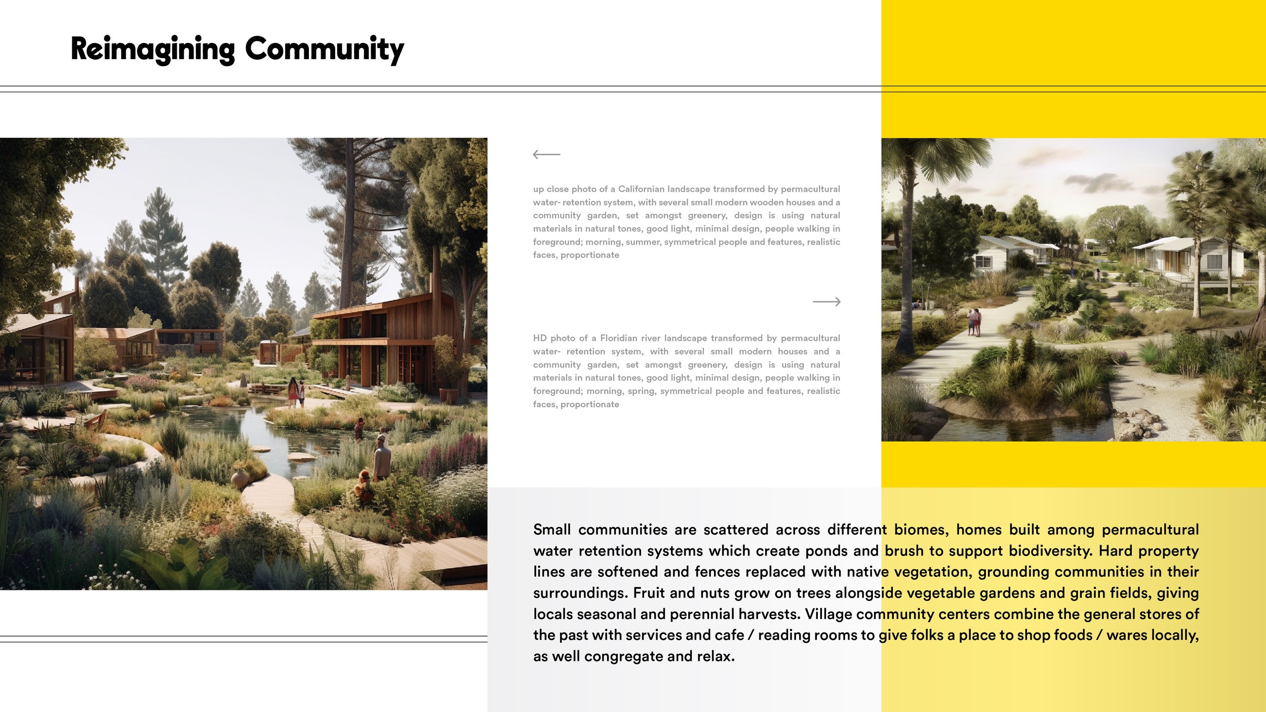
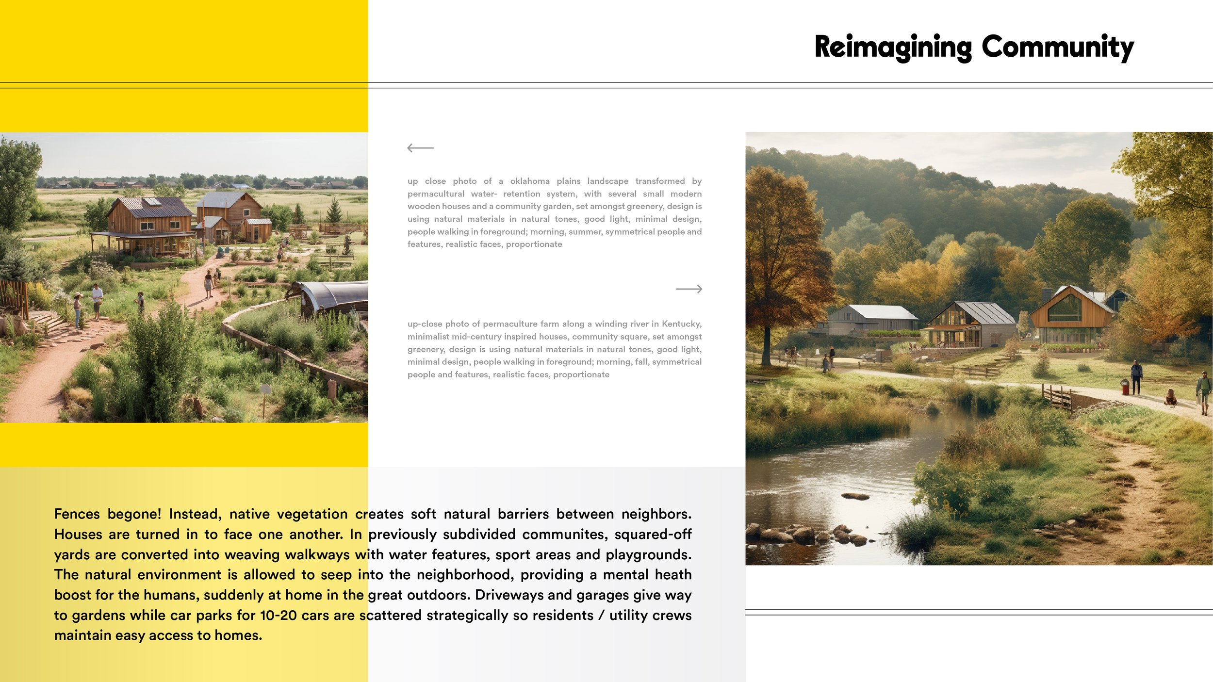
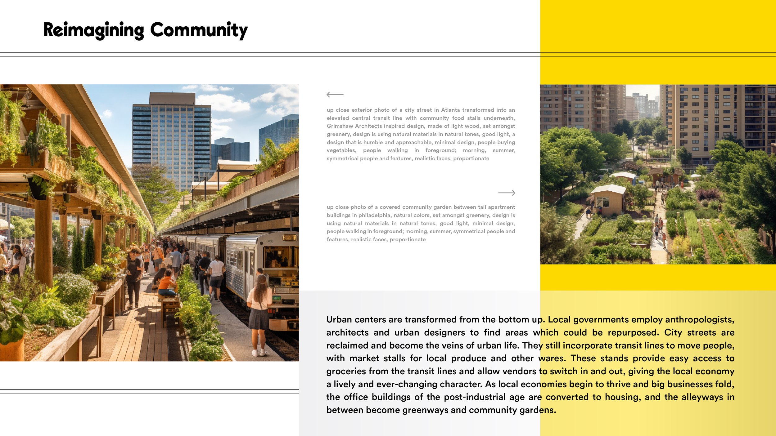
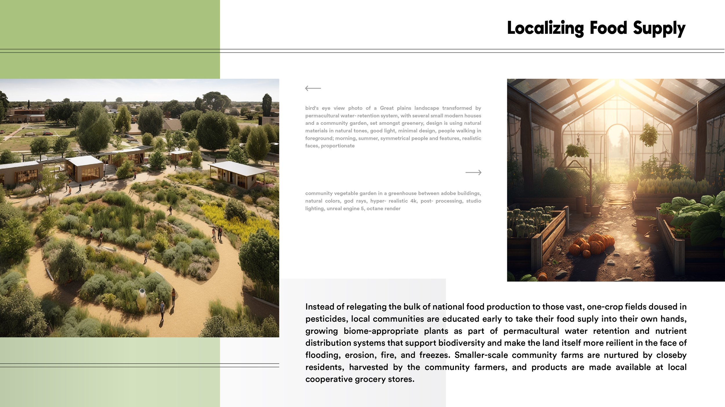
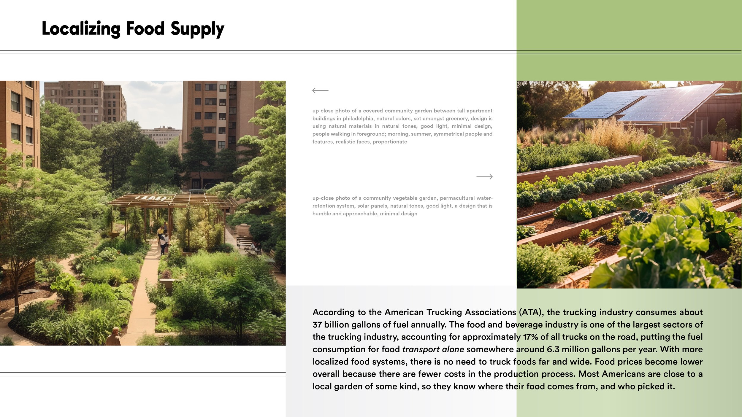
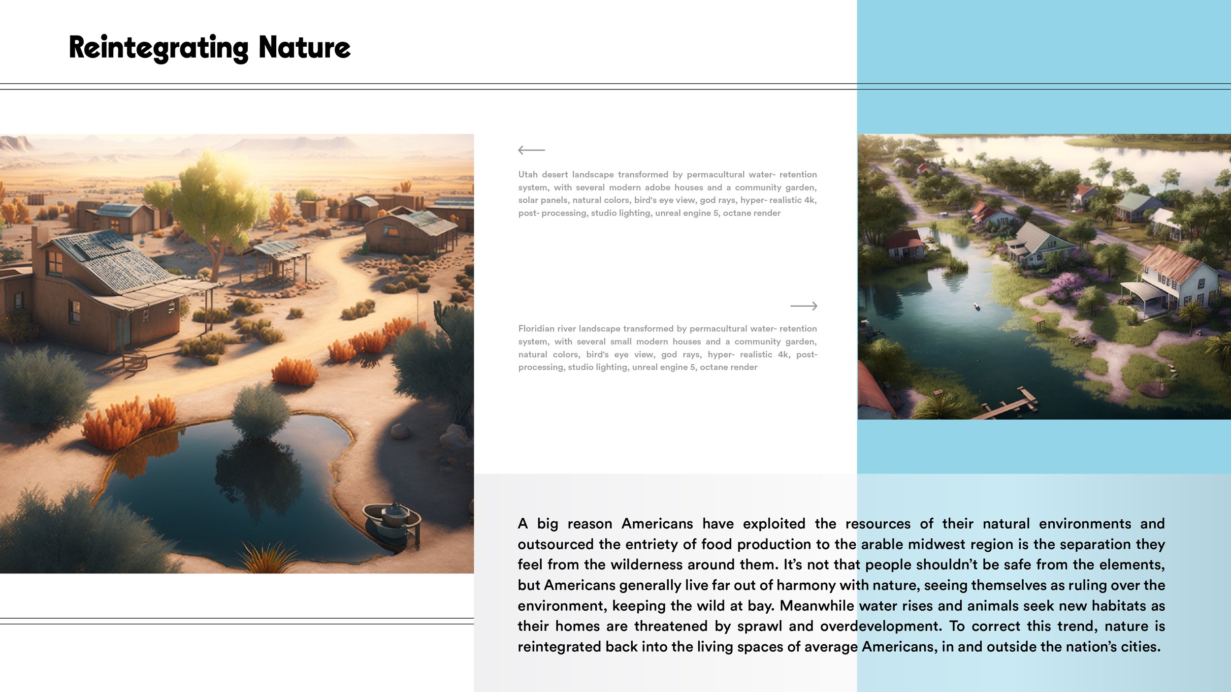
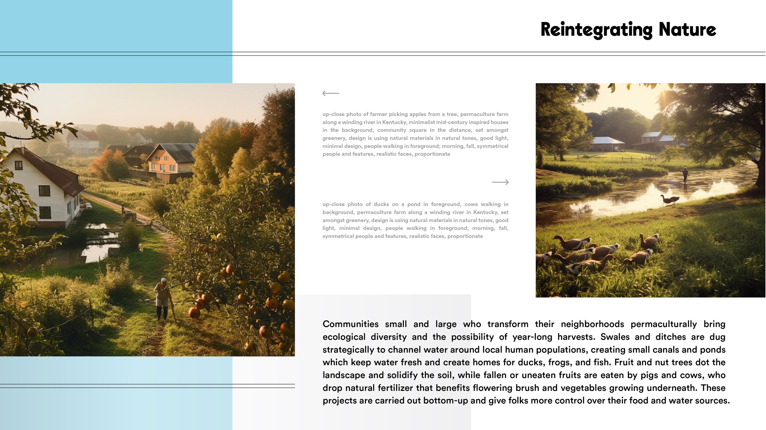
/imagined Permacultural Communities of the USA

Inspired by my recent studies and spurred by an AI design competition conducted by SPACE10, I put together this presentation of a future America in the present tense.

I created AI visuals to illustrate how permacultural techniques could be applied in cities and towns across the nation to create a more desirable American life. Please check it out below.

All images were created with Midjourney and the prompts are included beside the images in gray.


PermacultureUSA-01.jpg
PermacultureUSA-02.jpg
PermacultureUSA-03.jpg
PermacultureUSA-04.jpg
PermacultureUSA-05.jpg
PermacultureUSA-06.jpg
PermacultureUSA-07.jpg
PermacultureUSA-08.jpg
PermacultureUSA-09.jpg
PermacultureUSA-10.jpg
PermacultureUSA-11.jpg
PermacultureUSA-12.jpg
Friday 05.05.23
Posted by Baylor Watts
 

'Othering' Ourselves: An Investigation of Borders

Hi there!

This is a little different than most of the notes I throw in my journal section. But I’ve recently done a semester’s worth of academic writing, ultimately to improve my style and technical skill. So I figured there was no harm in sharing one of the essays I wrote this semester at UvA, just as a time capsule of sorts. I’m not quite happy with all aspects of the essay, and there are things here I hope to flesh out more one day. But this was my favorite essay from the semester. If nothing else, it made me think about borders and migration in a whole new way. The assignment asked me to explain what borders ‘make’ and ‘do,’ based on the book Illegal Traveler: An Auto-Ethnography of Borders by Shahram Khosravi. Please enjoy, or don’t. It’s your life.


Borders are meaningful constructs which inform the way we as people view the nation-states that are in many cases the bases for personal and collective identities. These borders have been naturalized into our very conceptions of land by their superimposition on rivers, mountains and deserts which physically separate geographical areas. While the mountains do not care if a person lives on one side or the other, the modern nation-state system depends on the distinction of what is ‘home,’ and what is outside. Here I will lean on the work of Shahram Khosravi and Nicolas De Genova to argue that borders which create a ‘self’ simultaneously create an ‘other.’ I make the case that while this delineation does grant many a formalized notion of ‘home’ and links them to a political body, the process ‘others’ anyone from outside the lines and leaves undocumented people without the basic rights gained through such a political belonging. This process is not simple and has several dimensions, from the ways border crossers are criminalized and borderlands ritualized, to the ways migrants are exploited financially, to the invisible process by which undocumented migrants are made to carry the weight of the border itself. Khosravi’s 2010 auto-ethnography, ‘Illegal’ Traveller, details his experience of the dynamics of Eurasian and Middle Eastern borders, while De Genova’s Annual Review article “Migrant ‘Illegality’ and Deportability in Everyday Life” is a summation of scholarship concerning undocumented migration up to the 2000s. They both lend theoretical support to the idea that the creation of borders in turn creates criminals for nations to defend themselves against. And while nations defend themselves against the crime they created, they alienate people who wish to move freely, not to mention those in danger who are forced to migrate.


            Recent discourses around migrants, refugees, and travelers have made clear the discomfort and defensiveness of major nation-states toward infiltration by refugees and undocumented persons. The defensiveness is most evident in the way the liminal spaces between nations are regulated. But why are borders policed so heavily? According to Shahram Khosravi, the illegalization by nation-states of undocumented crossing has made anyone who needs to cross into a criminal. He references Catherine Dauvergne: “Redefining a social issue as a crime, and categorizing an affected group as criminals, is a political strategy to legitimate further intervention into matters not previously regarded as criminal” (Dauvergne 2008, cited in Khosravi 2010, 21). In fact, some of the men Khosravi met while detained at the border of Iran and Afghanistan were Baluchi tribesmen, who at one time crossed the border freely but now do so in violation of the nation-state system (Khosravi 2010, 17). In short, the border makes criminals. In the defense against violators, systems have been put in place to regulate who enters and exits the country, and not all migrants are treated equally in the process. The first line of defense is at the borders. Border cities used to be the primary checkpoints in some places, but as tactful travelers began traversing rugged mountains and vast deserts to find passage, governments started to station border agents strategically along more remote stretches. (Khosravi 2010) When border transgressors are found out, they are usually detained and later deported. Unless, like 500 human beings a year between Mexico and the United States, or 700 along European borders (Khosravi 2010, 28), they never make it to the other side. As Khosravi puts it, “Sacrificing border transgressors is part of the worship of the nation-state and acknowledgement of its sovereignty” (Khosravi 2010, 29). When secure borders require sacrifices, border crossing becomes a ritual. Migrants prepare themselves to cross over from the pre-liminal (their country of origin) to the post-liminal (their destination) via the liminal (the borderlands). Ritual performances are thus expected from all parties. The border crossers are expected either to act like they’re just travelling, or act like a refugee seeking asylum, even if the migration is not necessarily forced. Khosravi talks about the necessity to “translate one’s life story into Eurocentric juridical language and to…wear dirty clothes and…look ‘sad’ and ‘profound’” (Khosravi 2010, 33). But these are not the only border performances. Patrol agents, bus drivers, airport agents, and lodging administrators are just some of the figures who play specific roles are poised to earn bribes from smugglers along the way. Not to mention much darker ritual acts, whereby many women expect to be beaten and/or raped for passage. Once migrants reach their destination, it is nearly impossible to relax. They are expected to be always on their best behavior, or risk arrest and deportation.


            As I mentioned briefly, not all migrants are treated equally in their quest to start a new chapter. This is because borders create their own economy, and not all migrants are of equal economic value to this system. In many cases, the need for cheap labor power means more young men are allowed passage. (Khosravi 2010, 27) Many women and children do not find a way through, because their labor cannot be exploited as such. De Genova asserts that “Undocumented migrations are, indeed, preeminently labor migrations,” and notes that the U.S. Border Patrol actually operated under the umbrella of the Department of Labor from its creation in 1925 until 1940 (Burawoy 1976, Bustamante 1972, 1976, 1978, Castells 1975, Chavez 1992a, Hondagneu-Sotelo 2001, Kearney 1998, and Rouse 1995a,b cited in De Genova 2001, 422). While discussing this capitalist use of migrant labor power, De Genova also points out that in the U.S., while laws may provide a ‘neutral framework’ for accepting and rejecting migrants, they are often applied unevenly, accounting for inequalities between demographics (De Genova 2002, 424). Because the legality is murky and a lot goes unsaid, the public perception may be that a certain population’s lack of success in the American economy is to their discredit. To speak to the stereotype that “Mexicans are good workers,” for example, this perception is probably perpetuated by the U.S.’s tendency to look the other way at the border when able-bodied men come in from Mexico, knowing that they will work for cheap and not complain, or otherwise risk being deported (ibid.). Border economies are at play around the world, with individuals and state agencies who rely on the profitability of criminalizing clandestine travel. Officers sometimes make enough to pay rent through the bribes they receive; Khosravi’s taxi was pulled over at the Karachi airport by police officers who collected 500 rupees from the undocumented migrants and sent them on their way. (Khosravi 2010, 19, 31) While illegal migrants are not necessarily welcome in their destination countries, states tend to use hopeful asylum seekers’ dreams and/or desperation against them. Even in their new ‘homes,’ many migrants are exploited and spread thin financially.


            Borders do not only affect their transgressors financially. They create symbolic divisions as well, which can be more enduring and discouraging. On one hand, borders were created to say where is ‘here’ or what is ‘home,’ and there are many people who benefit emblematically between those lines. A sense of pride and belonging is bestowed upon the people who fit the geography, and between the ‘color bars’ (Balibar 2002 cited in Khosravi 2010, 98). Etienne Balibar gave an example of ‘color bars’ in an interview: “When you are in the US, and you apply for a job, sometimes you have to fill out a form. It’s officially for equality and anti-discriminatory policy, but you have to cross boxes: Caucasian, African American, or Hispanic. What are these? What they wanted to include were three forms of discrimination” (Balibar, 2019). This is an issue with the creation of an ‘other’. Seemingly benign questions on a survey can subliminally influence the perception of someone, when often knowing their color is not necessary at all. Khosravi likewise imparts the experience of ‘inclusive exclusion’: “Undesirable people are not expelled by the border, they are forced to be border” (Khosravi 2010, 99). When people are made to feel neither included nor excluded, their life is lived in a constant liminality.

This hesitation to extend perceived ‘outsiders’ the symbolic belonging of the nation is a consequence of borders. Balibar talks in the same interview about the legacy of colonialism being visible today in the way racial hierarchies that were once enforced, legislated, and widely projected are now residual feelings of superiority and deservedness (Balibar 2019). There are still people in every country who see themselves as more (or tragically, less) deserving of a certain set of rights and principles which apply to a constantly morphing population on any arbitrary swath of land. As Khosravi put it after his Afghan informant living in Iran thanked him as the host, “The immigrant as a guest is a metaphor, but people have forgotten that it is a metaphor” (Rosello 2001 cited in Khosravi 2010, 93).


In conclusion, borders are complex mechanisms of human design, put in place to support a desire to categorize. Borders do not only delineate land and embody political entities. They create clandestine economies, confine sets of rights and principles to certain areas and people, and function to reinforce the invisible legacy of colonialism and slavery through complex legal and economic exploitations of anyone deemed ‘other.’ Frankly, it looks to me like there are people who hate the ‘other’ because they struggle to relax the mental hierarchy by which they perceive themselves as above, and so conceptualizing others’ equality functionally lowers their own self-perceived status. Borders, as an extension of this, feel like an immature and insecure justification for reducing ‘higher’ and ‘lower’ to ‘insider’ and ‘outsider’ by drawing an arbitrary line in the sand. Theoretically speaking, these are problems associated with viewing the world dualistically, and if we are to reduce border-related death and trauma around the world, we must do so by thinking dialectically, thawing out the concepts of ‘us’ and ‘them’ until they melt back into one.

Friday 01.20.23
Posted by Baylor Watts
Comments: 1
 

To the point that looking for a lost global civilization is pseudo-archeological

These are some thoughts I put down while watching Graham Hancock’s Ancient Apocalypse documentary series on Netflix. When looking through the notes on my phone I noticed this one full of useful questions to ask as we gain new information about the scope of history.

The show stirred some controversy, but I attribute some of the heat to the way the information was presented. Taking the new information for what it is, I can say this show left me curious about history again. Reminds me of the discovery channel documentaries that riveted me in my youth. I’ve been interested in Hancock’s theory for years, and seeing it presented with real quality by da ‘Flix felt like a big step.

While watching, I found myself wondering…

Are the questions posed leading questions?

Do the questions posed challenge long held beliefs?

Are the similarities across Ancient ruins in Egypt, Greece, South and Central America, India, Cambodia, Turkey, Japan, Easter Island, and Africa not striking?

Is it not worth asking new questions just because we think we know the whole story?

All the details could be a coincidence, but when considered together, do they not stir your curiosity?

Is there any harm in asking such questions and studying such a connection?

Where did these civilizations go when they disappeared?

When seen as a mystery, what steps can we take to find clues?

What are new questions we can ask which may help us gain new insights?

It is clear to me that we do not study these civilizations enough because we consider ourselves more evolved than the builders of the past. The global games we play together now are masculine, dramatic, high-stakes affairs, characterized by miscommunication between nation-state systems and gross indifference to our common humanity as a concept. With the current configuration of our priorities, there is no money to be made by re-establishing the connection. No desire to challenge the paradigms which give structure to our worldview. No funding available for gathering ‘irrelevant’ intelligence. What will it take to bring us to our senses? How will we be made to finally feel small enough, but special enough to look inside ourselves for answers?
Thursday 01.19.23
Posted by Baylor Watts
 

How to smoke weed

I read today this today:

“Weed gave me a way to slow down and be present with my body and allowed me some space to better be able to sit down and write. It meant a lot—and still means a lot today—as somebody who has ever-racing thoughts."

Annika Hansteen-Izora said it and I couldn’t agree more.

I was waiting until I quit my job at a company to be more open about my experience with weed. Now that I’ve quit, I know that to continue pushing off my responsibility to live in truth would be succumbing to a stigma assigned to the plant’s usage by a power structure obsessed with control over subversive cultures. I am proud to be a part of a culture of disobedience, because I know it poses a threat to a series of false systems we’re afraid to admit are actually harmful, racist, greedy, etc.

I love my relationship with weed. I have to tell myself all the time that it’s okay to feel how I feel about it. Because I didn’t even expect to like it, let alone be passionate about something I was always told was not worth trying, or in love with a group of people I was told I shouldn’t hang around with, or so saddened by the effects of its illegality, which is now pretty much universally recognized as a smoke screen for detaining black and brown people for decades. No one should be in jail for weed.

I’ve met a lot of people here in Europe that I’ve watched carefully conceal their judgement when I tell them I smoke every day (under normal, non-traveling circumstances). I’m glad they don’t come right out and tell me it’s stupid or whatever, but the look in their eyes changes, and the corner of their mouth tightens, and I watch the gears in their brains try to reframe my existence into a new category of person that frankly I’ll never quite fit into. I can tell they think just the slightest bit less of me until I can win them back with a joke or two at my own expense.

That’s the problem, though.

Cannabis is a plant that, when used properly, I’ve only ever seen turn people into healthier, happier and more understanding people. It’s a better depression medicine than any pill, a better muscle relaxer than any sedative, a better life-supplement than any vitamin. It helps with pain and loss of appetite, it’s helped me work through grief and sadness without numbing my feelings, and it stems some really excellent ideas, as well as some rather incoherent ones. It’s a beautiful and useful plant that doesn’t deserve to be treated with a wink and a nod every time we talk about it.

And as long as black and brown people are still being disproportionately locked up for using it while the data shows they are no more likely than white people to use it, making nervous jokes or dismissing stoners as second-class citizens will just be thinly-veiled ways of avoiding our responsibility to safeguard each other’s well-being.

That’s what I think about it.

I’m no longer ashamed of myself or worried about my habit.

No longer scared of people thinking less of me, because I understand where the fear comes from and it’s not real.

No longer scared of authority because I know they’re scared of me.

And I’m no longer quiet about it because I hope you are not quiet about the things that you love and the things you feel are important.

But that’s just me, so here’s this:

A couple notes on safe/suggested usage:

Everyone that has told me that they tried weed once and will never ever do it again has told me almost the exact same story. That’s about twenty to thirty people in my life and about five people since I’ve arrived in Europe three weeks ago.

Generally the story starts either in Amsterdam or at a party, and it includes a group of friends, a full night of drinking, and eating a whole edible. Or 30 edibles at once in one outlying case (you know who you are). I believe every single person who tells me this was a terrible experience. I know from experience that edibles are very powerful (I once ate a whole edible on my birthday and got so high in the shower that the bathroom fan started to sound like a fire engine, which meant obviously my apartment was on fire, which meant I had no time to rinse the shampoo out of my hair and I needed to run half-naked and sudsy into the living room where my friend was staying on my couch), and that drinking usually adds a creeping, uncomfortable nausea to a powerful high.

Please, for your own sake, be safe, careful and intelligent, especially when trying weed for the first time. Here are a some guidelines I am happy to give you.

  1. Split your edible in half. Then wait an hour for it to kick in. If it’s been an hour and you don’t feel anything, wait another 20 minutes just to be safe. It will hit you like a freight train (it may hit you slowly, but it is still a train).

  2. If it’s a joint, take ONE hit from the joint, then wait at least 5 minutes until letting your friend peer-pressure you into taking a second. Same deal here. “I don’t feel anything.” -> “Wait, do I feel something?” -> “Oh, here it comes.”

  3. Speaking of peer-pressure, make sure you are with people you are very comfortable with, because cannabis is a mind-bending substance that will turn a group of loud and apish boys into an enemy horde that is out to get you.

  4. To those who got high one time and started crying uncontrollably, I am sorry. Weed can be known to bring repressed or unspoken thoughts and feelings to the surface. It’s best to work through them rather than against them. Ultimately the process is probably good for you, but this is why comfort is key. Get high with your best friend, or someone kind and understanding, just in case you have to confront something you wouldn’t want to share with anyone else.

  5. Try it in nature, not somewhere busy and public. Like, definitely opt for a sunset rather than a concert when you’re getting used to the effects. A concert will become an excellent place to get high, but start with something you can just let your perspective rest on, like a movie or a lakefront.

  6. Eat something. Pretty much anything. Something fresh ideally, but after like 40 minutes, a cake with mayonnaise frosting may start to make sense. Experiment freely, but don’t be gross.

  7. Lastly, just be yourself. Do something you usually do, for another layer of comfort. Listen to music. Create something. Write down all your highdeas. Some of them will be great, some of them will make zero sense. I mean, “cars are cows with windows?” What does that even mean?! Just don’t judge yourself, or take yourself too seriously. Don’t be embarrassed when you say something silly and people laugh. Enjoy the moment and the laughter and the kinship. You are here on earth to enjoy nature and food and company, and weed is my favorite vessel for keeping me present.

Thursday 06.09.22
Posted by Baylor Watts
 

We have been so foolish.

So scared of being wrong that we can’t change our minds.

So scared of being judged that we can’t be honest.

So scared of being weak that we can’t be vulnerable.

So scared of ourselves.

I mean,

Who could ever love us?

Who could ever be stupid enough to love us?

Can they not see how dangerous we are?

Can they not see that we want to be alone?

This is my country. This isn’t their country.

This is my domain. This isn’t your concern.

This is MY land. Get off MY land.

This is MY money. Get your OWN money.

These are MY guns. Don’t you TOUCH them.

These are MY wounds. Don’t you TOUCH me.

DON’T YOU TOUCH ME.

DON’T TOUCH ME.

DON’T COME CLOSE.

DON’T YOU DARE.

I AM TOUGH. I’VE BEEN FAIR.

I AM STRONG. I DON’T CARE.

I CAN DO IT. I CAN PROVE IT.

I CAN I CAN I CAN

Are you okay?

…………..

I hate being away from America in times of anguish.

My mom told me she’s glad I’m not home for moments like these.

That thoughts and prayers are all that’re shared, and there’s nothing we can do.

I know she’s right, too.

But I want to hug my friends.

I want to cry with my teachers.

I want to sit slouched on my porch and smoke.

I want to stare into space and lose hope.

I want to shed one tear at a time and think quietly to myself:

“Step by step, day by day, we’re going to have to take this country into our own hands.”

I’m sorry, but we have to protect our kids, even if it means teaching them ourselves.

No one else is going to teach them the truth.

Not because they don’t want to, either.

They’re not allowed. And maybe they’ve been lied to themselves.

Maybe. Maybe. Maybe.

The truth is bleak.

The truth is nuanced.

The truth is overwhelming and nonlinear and infinite and multidimensional and it shifts every second and it scares the living shit out of me.

And you know what the hardest truth is?

The kids know the truth.

They feel the truth in their hearts and they can’t put it into words because no one has ever said it to them.

They’re waiting for you to say it so they will know they’re feeling the right emotions and hurting for the right reasons.

They’re waiting to see your face change to meet theirs. Waiting for you to hold them and cry with them and show them you care.

But we don’t tell them what’s true, we tell them what’s correct. Dancing carefully around the truth just so as not to say the wrong thing and upset the wrong person who could fuck up your life if they knew you were right.

To try to speak the truth out loud would require a level of trust we have never had to place on the young. A level of responsibility we feel ashamed of skirting for so long. A level of accountability we are deathly afraid to take.

But we’re past that. It’s time to own it.

Children’s lives are at stake.

I’m sorry. We’re so sorry.

This is your world now.

Sunday 05.29.22
Posted by Baylor Watts
 

Notes on White Supremacy and Ethnically Motivated Shootings

All thoughts my own, from my unique but limited perspective. Take anything with you that feels true and leave anything that doesn't resonate.


A lot of boys in the US and abroad are finding a community of likeminded white men who like to remember their role in history as mostly or wholly positive. I understand it’s difficult to face the wrongdoings of past ancestors, because it often feels like rejecting a part of oneself, and this is painful, uncomfortable work. But it’s astounding and scary to me to watch so many men tense up at the mention of past injustices of white men. Like this fire in their eyes, and a cunning decision in their cheekbones to restrain the tongue. As I’ve said my piece to a couple such men, I’ve gotten this strange feeling like they had switched off listening to me, and gone blank so as not to hear this poison I’ve decided to direct at them for the purposes of shaming them and to put myself on a pedestal. “He’s on their side now,” they think at me. “I will not be talked out of my superiority. For if history shows us anything, it’s that the world is a better place when white men are in charge.”

And I have been to the imaginary mountaintop from which they think that. I was raised in America and taught history from Floridian textbooks. I mean, worldwide power and control over most other people who they felt were inferior for one reason or another? Which pretty much includes women, refugees, black and brown people, and anyone from another faith or religion outside of their own? Sounds like a good situation for them. I am a white man myself, so humbly, I’d add that I don’t say “them” to separate myself from white men. I say “them” to make a distinction between the white man that sees his place as higher than others (whether acted upon or not, because much of the population appears to resonate silently with this axiom), and the white man who is constantly doing the work required to comprehensively void such mental structures.

I see myself in the second camp. I am not ashamed of my personal family history, and am proud of many of the accomplishments and stories I’ve heard from the bloodlines that flow through me, white or otherwise. I do not see the achievements of my ancestors as unearned. But I know in my heart they were often, inherently, earned on rotten grounds. And how earned is a victory if the game was rigged in your favor? Isn’t a life that can only be won or lost inherently unfair to those who don’t want to play the game at all? We white men have created a gratuitous reality involving the whole of society, in which no one else can succeed. I can’t remember if it was painful to admit this to myself, but I can say after several years of accepting that reality, I feel so much better and so much less defensive. I can be much more honest with others now that I’m honest with myself. And the beautiful thing is that the truth is always messy, so exchanging personal truths with someone different to you in skin tone or ethnic identity is life-affirming, as you start to realize how much you have in common, and how to trust one another in the present, despite the very complicated and prismatic truths of history.


I am the son of two Americans, one of which is from a long line of white Floridians that reaches back to Kentucky and New England over some 10 generations. The other is the product of Swedish and Mexican immigrants back 1 or 2 generations.

This isn’t important for the collective, but it’s important to me. My perspective is unique because of the nuances, just like everyone else. And there’s contradiction in my blood, which I feel daily. I know living in the spaces between truth is not an easy or relaxing life to live, but I welcome the contradiction at my core for its creative potential. One half of me is always at odds with the other half, in this beautiful dance around the singularity. Truth. Or God. This is a process which produces ever-better language for me to use. And visuals when I can muster them, if only I work hard to see clearly and trust myself to be truthful.

Monday 05.16.22
Posted by Baylor Watts
 

Notes on Sports During the Pandemic

WordsonBedsheets-04.jpg WordsonBedsheets-05.jpg WordsonBedsheets-06.jpg
Monday 05.16.22
Posted by Baylor Watts
 

Rays The Bar - Reimagining the Tampa Bay Rays

When I was nine, I started watching baseball. I had played for years, but for the first time the professional storylines held my attention. Several years prior, probably around 2006, I rode along to my first major league game with a group from my dad’s work. We drove three hours to the Trop, home of the Tampa Bay Devil Rays. If I remember correctly, I think they lost that game, but I decided this was to be my team. 

But this was not yet the team I would fall in love with.  I became a Rays fan in 2008.

Ahead of the 2008 season, Tampa Bay shortened its name to the “Rays,” spurring a full rebrand. Professional Sports Design Juggernaut Fanbrandz retooled the Rays identity, throwing out the green and black for Navy, powder blue, and yellow swatches. I can remember the news coverage of the press release. I remember seeing the uniforms on the field for the first time during spring training (my godfather took me to a game, during which Jonny Gomes broke his nose sliding into third, for reference I guess). From the jump, I was obsessed with the blues and yellow. Not just the players or the team, but the colors, the logos, the uniforms. I received a batting practice jersey as a gift in 2008, and a home jersey in 2009 with B.J. Upton’s name. One of the first things I saved up my own money to buy was the on-field Rays cap. My dad waited in the car while I stepped into Hibbett Sports with my 36 dollars and bought it myself. 

I did not want the adjustable hat, or the white one, or the one with “Rays” written over the left ear. The Rays on the field wore a navy New Era cap with the MLB logo on back, and our “TB” mark faced front. When you wear the uniform, you are not just a fan. You are a part of the team. 

All this is to say:

The Rays 2008 rebrand effectively dictated my life’s direction then and there. I owe my livelihood to those logos and to Fanbrandz and so forth. Which is why it pains me to suggest that this identity may have run its course.

No fret, though! I fully believe that it served its purpose: to modernize a young but somewhat unsuccessful expansion team with an identity born of 90s trends and diluted over time. The current set is a somewhat trend-proof look. Nothing screams “EARLY 2000s!” and it is fairly refined. Nothing more, or less, than was required. Which allowed the Rays, for the first time, to begin attracting attention. First with their playing style and a notable rookie third baseman, later by way of good management and player development. Now the Rays are emerging as a highly competitive franchise, enjoying a steady stream of pitching talent and young offensive up-incomers, exciting a civic fanbase for the first time in a decade. Meanwhile, the Rays’ once transformative brand is slowly becoming a little lackluster. 

So with a city beginning to embrace its 22-year-old hometown team, and an increasingly impressive team at that, I believe the following brand update is a way for the West Florida ball club not only to acknowledge their new wave of Floridian supporters like they did for me in 2008, but to make a sartorial point with a bold new look that makes a lasting impression across the league. Like any sort of brand, a confident, distinctive identity goes a long way.

Here’s the fun part: The button-fronts you’re about to see say “Tampa Bay” but represent a potentiality that the next Rays identity should embrace two hometowns. Therefore elements of the new identity are meant not only for general sexiness, but to honor the legacy of our could-be sister city.

Alright.

*Deep breath*

Here we go:

NewRaysLogo2-01.jpg

Cap logo - Refinements

The Montreal Expos, born just before the first breaths of the 70s in a city known for its incredible mid-century designers, debuted a thoughtful, stylish logo for an avant-garde baseball club. The Rays did not exist in the 70s, but for the first time in 2012, they pretended they did. Their late 70s “faux-back” “tb” logo (above, left) honestly may have been the best in the team’s history. To be fair, the 70s are not a bad time period to emulate, from a graphic design perspective. But beyond its charm, there were some little issues that needed refining. I went ahead and clarified some of the line work and softened the corners.

The counter of the “b” has been made to look more like the slices of an orange, since before I could not tell whether it was supposed to be citrus or the sun. One should be wary of Nike-style marketspeak and reading too far into every detail, but there is something to be said for logos that truly capture the character of a place. The relaxed, easygoing lowercase “tb” feels a part of the casual, beach-side spirit of the Tampa Bay Area, whereas the current monogram’s serifs are just too formal, and the shadow effect is pleasant but not really necessary. 


NewRaysLogo2-02.jpg
NewRaysLogo2-03.jpg

Word Mark - Redesign

The current shirt mark and primary logo uses a big swooshy “R” to give itself a major organic element, but is otherwise very structured in its use of Roman, small-caps type. Where most baseball teams have a loopy script or otherwise regionally appropriate identity, the Rays’ logo feels faintly like a sports bar chain and not particularly Floridian. (Again, all objective criticism. I personally feel a deep connection to the current marks, but that doesn’t make them perfect.)

So I reimagined the “Rays” logo too, setting it in a soft, custom lowercase font that matches the “tb” mark. A slight upward grade makes it less weighty, and the citrus burst makes another appearance!

Additionally, in an effort to embrace the local fanbase (and give them some killer (and might I say stylish) merch that promotes civic pride), I wanted start using “Tampa Bay” again. So in the same lettering, I created a pitched “tampa bay” mark to be worn on the road.


The uniforms

Unexpectedly, the fictional 70s kits also perfectly captured the spirit of the Gulf Coast in ways the Rays official identity could not.

Meanwhile, The Rays play ball in St. Petersburg, a city sat between the deep blue of the Gulf and the bright blue of the sky. Both of these colors see huge use on both the shirts and pants of the 70s garb. The yellow shines through appropriately as the ever-present sun on the coast. The navy stirrups / yellow sanitaries are a particularly lovely touch. 

I wanted to draw the fun out of these fauxback uniforms, particularly the colors and their boldness. But these new uniforms are not as much a caricature of 70s design, nor as much a Southern Californian grave robbery as the faux set. Instead I modernized the important elements (thick striping, more prominent yellow and light blue combo). I also added TV numbers to the shirtfronts because I’m a sucker for ‘em and I do what I want.

RaysTheBars-01.jpg

Home whites

The home kit is a familiar white outfit with blue details. The chest features a new “rays” mark with a central burst of citrus. Thick sleeve stripes cuff the home shirt in navy and light blue (from here on out I will be calling them sky blue and gulf blue because that’s better for marketing and I do what I want). 

RaysTheBars-03.jpg

Road blues

In 2019 there was a stretch of 9 or 10 straight road wins that all came in navy tops. By record, I’m pretty sure navy is our winningest color (I’m keeping track this year and I’ll keep you posted, don’t worry). So as teams like the Padres take baby steps away from traditionalism and reimagine their “road grays,” I imagine the Rays, as another team with unconventional and creative on-field strategies, might do the same. The primary road look for the road warriors now features sky blue bottoms under a gulf blue top. That same thick piping caps these sleeves in sky blue and white. “Tampa Bay” spans the chest for the first time in the Rays era, now in a bold yellow. 

RaysTheBars-02.jpg

Home alternate

It’s always sunny in St. Pete, so sky blue and yellow take over the traditional home kit. The lighter shades of the new identity shine through here, sky and sun a combo as expressive to me as the Dolphins’ teal and orange. A true Floridian outfit for Sunday home games. Emphasis on the sun. 

RaysTheBars-04.jpg

The Montrealternate

This here is the Montreal influence. The “tb” chest mark where the expos’ beaut used to sit. The shoulder stripes from collar to sleeve cuff is another expos reference, this time in navy and yellow, as secondary colors to the sky blue base. This uniform set is to be worn for Saturday road games and select home games played in Montreal. The tri-color caps, atop this uniform and the other home looks, are Montreal callbacks as well.

—

So there it is! My goal was to add some sunlight and personality to the identity that reflects the character of the region, and that’s what I’ve got. Thanks for looking and reading through. Let me know what you think of the ideas and the executions and so forth. 

PS: 

For the nerds out there, I know this is not Daniel Robertson and I know he’s not a pitcher, but his name was long enough to test the radial arching and his 28 is a good-looking number. 

Mockups by Brandon Williams at Webpixum Sports Mockups

PPS:

Go Rays. This is our year. 

Friday 03.13.20
Posted by Baylor Watts
 

A Trophy Is A Cup That Holds Nothing and Everything: The Idolatry of Sports

I love sports. But to be honest, I have only ever watched baseball on purpose. Until this year. This year, I’ve made it a goal of mine to come to an understanding and appreciation for football (soccer) and basketball. I’m really starting to like them, but the problem with the NBA and the Premier League is that I didn’t grow up watching, so now I am without teams to follow. I’m sure that’s not hard to relate to. Part of the reason I love baseball and love the Tampa Bay Rays of all teams is that I grew up watching them and have participated in their history. Through a rebrand (my first substantial memory of them) in 2008, to the postseason, to the world series, to coming up empty, to coming up empty for another ten years, to a 90-72 season in 2018. They are my team and I love following them to nowhere.

Now in the past several weeks, I have been seeking out a Premier League team to follow. My criteria are: well designed uniforms (so basically any Nike or Umbro club), a loyal following for an underdog team of sorts, and honestly I’m also just feeling around for good vibes. But while I found an extremely loyal fanbase, a good uniform, and some really nice vibes in Liverpool FC, I have a hard time committing to follow a team that’s atop the table and has a chance at a Premier League title. I figured this was just because I’m uncomfortable liking successful teams. But it wasn’t until Roger Bennett of the “Men in Blazers” podcast beautifully articulated his experience of sports that I would really understand my own experience, and not until a related text from my girlfriend that I would understand how my experience of sports is tied to my experience of religion and philosophy. Both of these are too good not to include:

Roger Bennett said of Tottenham’s trophy hunt:

“...I don’t care about trophies. I don’t watch sports for trophies. I watch to experience moments. Feelings, really; Feelings that we’re meant to feel in real life. Emotions, I guess. I mean what is the big deal about winning? I think about life and football, any relationship, any marriage, friendship, living with a partner - even with absurd levels of chemistry - it’s not all joy. You work hard, you make great moments happen, you revel in those great moments in the relationship…And it’s the same with a football club. It’s a two way commitment to work bloody hard to give something of value to each other.”

When I sent this tidbit along to a friend, they sent me this text:

“I just realized, trophy is nearly synonymous with idol! Pete Rollins would approve of this experience of sport, I think.”

Which brings us to Pete.

Peter Rollins is my favorite philosopher and theologian. Currently he is working on creating a branch of theology called pyrotheology, which he describes as “creating freedom from the tyranny of certainty and satisfaction.”

On his podcast, Pete talks about the idea that you get more out of enjoyment than pleasure. If you think about Christmas, you might come to realize that the pleasure of opening your gifts on Christmas morning is less exciting than the month of enjoyment you get from the sheer anticipation.

Similarly, in sports, you may find better fans, or fans who are enjoying themselves, in the cities without a steady stream of trophies. The Cubs, the Rays, the Mets. Our teams agree to engage in the fantasy of the trophy, the pleasure of winning it all, but fans of shit teams have come to understand that it’s about the enjoyment. It’s great to see your team win, but in the end it’s better to see your team lose and to be a part of that struggle. These fans know that sports can just be about moments and emotions. Reveling in the great moments and working bloody hard to give something of value to each other. That also may be why people hate fairweather fans and why I had a hard time committing to Liverpool. It’s all pleasure without the shared experiences of enjoyment.

So that’s the idea. But I just want to briefly touch on the trophies themselves. As Micah said, “trophy is nearly synonymous with idol.” So here comes the irony.

For those who don’t know, I now work for a professional ultimate league and have been tasked with designing a trophy. I’ve had thoughts on it for a while, in regards to how to create a shape that can be used for marketing and such. Furthermore, I was talking to Todd Radom this week (humble brag) about trophy design, and he mentioned the fact that even the iconic shapes of the Vince Lombardi trophy, the MLB Commissioner’s trophy, and the Larry O’Brien Championship Trophy only came about in the last 60 years. My impression before this conversation was that competitive sports are only functional because a group of players and staff agree to buy into the fantasy that if they could just hold that trophy they would feel whole and complete. Or possibly that they’re working so hard to eventually feel the pleasure of reaching their goal. And my thought was that in designing a trophy, my task is to design an object worthy of fantasy. But what I’m realizing is this:

A trophy is like money. It’s only worth the amount it costs to manufacture it. So the value of a trophy is mostly housed in the meaning we read into it. A season’s worth of hard work. A series of rebuilding years. Losing certain players in exchange for fresh faces. Any hardships, tragedies, triumphs, comeback wins, and intense emotional experiences will attach themselves to that object. So for each team, the trophy becomes a physical manifestation of their unique circumstances and every reason they must win it all.

I’m not saying I’m not going to design a dope trophy, I’m just saying a trophy is a vessel that houses whatever meaning you put in it. Often, they’re even conveniently shaped like a cup to hold all the meaning, or cereal, with which you wish to fill it.

I wouldn’t call this essay concise, and everything I’ve written has opened up more questions than I could answer. But I’m going to free myself of the tyranny and satisfaction of answers, and allow myself to leave it there. Better yet, I’ll actually help you to keep unraveling the rope with some follow up questions for you to ponder if you’re hungry. Open wide:

Are the Yankees, Red Sox, Patriots, Man City, etc. buying pleasure? Are their fans enjoying themselves?

The Yankees postseason hashtag is #chasefor28. What does that say about their situation? Was winning the World Series 27 times not enough? It may be good for the sport that they continue to engage in the fantasy, but when the most successful franchise has to specify that they’re chasing their 28th, do you get the impression that winning loses its significance?

When starting up in a new league, is it best to be aware of the powerlessness of the trophy-shaped-hole and pursue enjoyment, or to engage in the fantasy for the sake of competition?

I know that’s a lot. But I’m really eager to hear what you guys think about this. So please hit me with any thoughts or questions. And a happy Super Bowl to you all.

Also also: Check out Pete’s work at PeterRollins.com or listen to “The Fundamentalists” podcast. I highly recommend.


Sunday 02.03.19
Posted by Baylor Watts
 

My Favorite Music of 2018

This year, I think more than usual, I’ve been pretty disinclined to take my headphones off. I’ve listened to a lot of podcasts and reached back in time to dust off some old favorite albums as well, but as a nice underscore to a long year, 2018’s new releases have been far from disappointing. I don’t really lean to one genre or another these days, so in my humble opinion and in no particular order, here are 2018’s best releases. Note: I hesitate to say albums this year because there are some killer EPs in the mix.


DcoFTFrUQAENfYb.jpg

Chromeo Head Over Heels

The first time I listened to this album was on a 2 hour drive back to my hometown and I don’t think I’ve ever danced harder or more freely whilst wearing a seatbelt. It immediately and consistently puts the fun in funky and has been my good mood album of choice since it came out this summer.

Play
 
serpentwithfeet- soil.jpg

Serpentwithfeet soil

Another interesting first listen as I heard this album for the first time on a plane. It took 2 minutes for whisper to overwhelm me in all the right ways. Soil is a work of art; haunting and beautiful, heavy and heartfelt.

Play
 
a1573301756_10.jpg

Foxwarren Foxwarren

With Andy Shauf and D.A. Kissick up front, this project is the next Andy Shauf album we were all waiting for, with the additional energy of a full band to back him up. The album is soft and dissonant as usual, but always resolving just the same.

PLAY
 

Big Red Machine Big Red Machine

This album so beautifully combines Aaron Dessner and Justin Vernon’s individual weirdnesses, while retaining their capacities for depth and lyricism. Gratitude and Forest Green underscored a lot of really big moments in my year, and I knew that would be the case as soon as I heard these songs. One of the best releases of them all.

play
 

Noname Room 25

Each song on this album is brilliantly made. And the way she chooses to string them together makes Noname one of my new favorite rappers. The album is wholly genuine, with 11 tracks about race, gender, relationships, and faith that are as light and airy as they are compelling.

play
 

Boygenius Boygenius

This third self-titled-project-where-individual-artists-come-together-to-be-a-band-for-a-second may be my favorite. A gorgeously mournful collection of songs from a trio of three of the best folk artists out there, boygenius is great for driving at night and laying down with your eyes closed. Let this one sink in.

play
 

Shepard Martin Postglam

Talk about heartfelt. This album so well encapsulates the feeling of being enamored with someone, and its singsong, whimsical delivery makes it that much more relatable and comforting. Big One was the soundtrack to my first week back at school this year, when that comfort was much needed. Shepard is a good friend of mine, and this album tells me he’s happy. Well done, Shep. I’m happy for you.

play
 

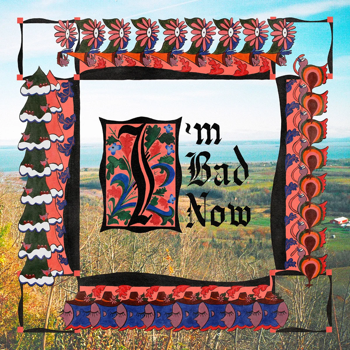
Nap Eyes I’m Bad Now

This was the perfect soundtrack to spring. I saw Nap Eyes live in 2017 by chance and they became an instant favorite for their easygoing electric guitars and loose but powerful drum parts. The vocals are similar to The Velvet Underground or Bedhead, which is a plus.

play
 
Mac Miller_Swimming.jpg

Mac Miller Swimming

His most reflective album, and my favorite in terms of composition. Great samples and bass lines. With bangers like Self Care and slow jams like 2009, it was a good note to end on, though it was unbelievably sad to see him go so soon.

play
 

Trevor Powers Mulberry Violence

He had to leave the Youth Lagoon moniker behind to appropriately express the amount of weird shit he obviously had built up inside him (peep some pictures of this dude), but I support his decision. Equal parts experimental and passionate, he put together quite a heap of highly jammable material, and I jammed hard.

play
 
Saba- Care For Me.jpg

Saba CARE FOR ME

I liked his last album, The Bucket List Project a lot, but damn. This is another album to put on, sit down, and just listen. A portrait of loneliness and life with other people alike, it’s a great collection. I’ll let Saba speak for himself. Listen below.

play
 

Frankie Cosmos Vessel

Just as simple and sweet as her other albums, but with more songs! Even less hit-or-miss than before, I’ll listen to almost any song on this album at any time. Her style is so unique and appealing, and it was an absolute pleasure to get some more of it this year.

play
 
a0202277470_10.jpg

Horse Feathers Appreciation

Appreciation indeed. Just when I stopped thinking about Horse Feathers on a regular basis, they came back strong with this perfect summertime sound. Appropriately, it was one of my go-to albums for the summer, but this new energy they found is matched by their signature folky sound, which makes it just as good for fall and winter (especially in North Carolina for some reason).

play
 
a0723799470_2.jpg

Lala Lala The Lamb

A classic indie album, but different enough to distinguish itself as one of the best albums of the year, in my opinion. The vocals make this difference in part, but they nearly come second to the album cover. A good cover goes a long way, and this album has a great cover. The Lamb is very well compiled. The order makes perfect sense, and like with Frankie, each song is just so good on its own.

PLAY
 

Rubblebucket Sun Machine

I wish I had found this album when it came out this summer, because its energy was sorely needed at the time. I can’t wait for it to lift me back out of winter in March. But again! Another album with so many good standalone bangers. Fruity is a favorite, and Party Like Your Heart Hurts is a great driving song (especially at night and/or on bridges) that might be my favorite song of theirs since Came Out of a Lady.

PLAY
 

Jose Gonzalez & The Bright Lights at Svenska Grammofonstudion

I like how this ep is titled, first of all. But other than that, it’s actually just a few of his old songs reworked with a group. This makes such a difference though, adding some extra power to his classic classical guitar and the pulsating personal sound for which he’s known.

PLAY
 

Ben Howard Noonday Dream

A departure from the sound of his two previous albums, Ben Howard dials back his own microphone and dials up the reverb. But somewhat surprisingly, he didn’t lose any quality in the transition. In fact, it may be an even better sound. Noonday Dream sounds like you’re underwater, or just generally moving more slowly. But it forces you to sink in and let it wash over you, which is an excellent experience that was especially excellent live in Chicago. Definitely a good winter album, so get on it.

(P.S: You can always tell when an artist’s about to change their sound when they delete all the pictures off their instagram and start over with a little slow-panning video of themselves by a pool.)

PLAY
Wednesday 12.05.18
Posted by Baylor Watts
 

In Defense of the Maryland Flag

df99805c9019d48ffd85f83ce384dc8b.jpg

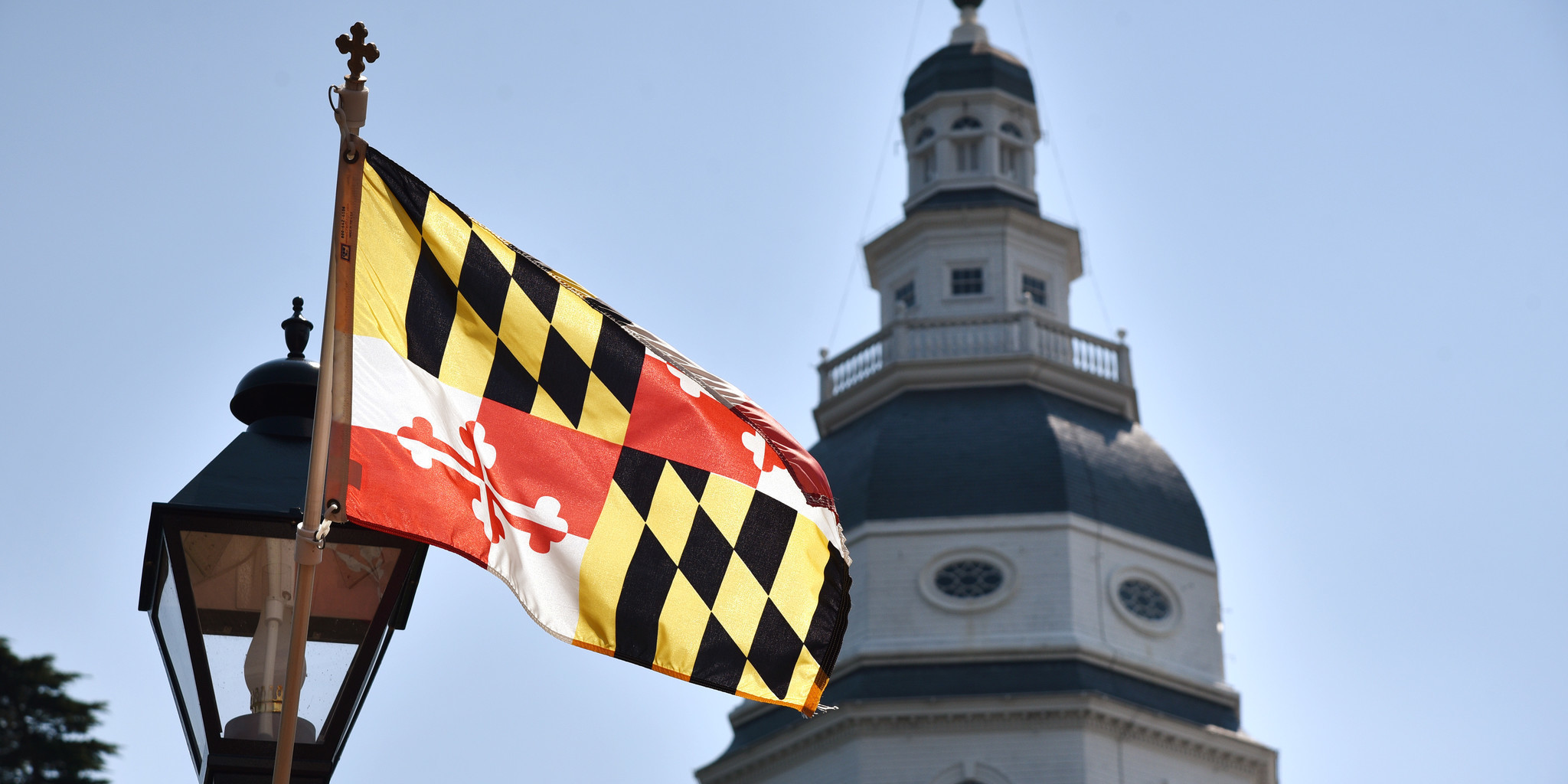
In late July, my girlfriend and I were making our way back down the east coast from Maine to Florida, and on the day we drove from Delaware to Washington D.C., some lane blockage on the Chesapeake Bay bridge kept us in Maryland for a little longer than we intended. As we sat in our Subaru over the bay, Paige and I had a silly, albeit heated disagreement about the goodness (versus badness) of the Maryland flag. At the time, all I could really think to say for its merit was that it was "a state flag done right.” The purpose of this post is to explain in more detail why that Maryland flag is a shining example of good vexillography and to generally shed some light on why it is one of my favorites.

Alright, first we’ll talk specs, or why it is a good flag, technically speaking. And we’ll start fresh. No child left behind. The principles of good flag design are as follows: 

  • Keep It Simple. The flag should be so simple that a child can draw it from memory.

  • Use Meaningful Symbolism.

  • Use 2 or 3 Basic Colors.

  • No Lettering or Seals.

  • Be Distinctive or Be Related.

I’ll admit. If you asked a kid to draw this flag, you might get two crosses and a checkered pattern; hopefully red, white, yellow and black each make an appearance somewhere. That one’s a stretch. 

But this flag is full of meaningful symbolism. I’ll try to keep it brief. 

The pattern that appears on the flag is derived from the coat of arms of George Calvert, the first Baron Baltimore (He colonized the area). The yellow and black pattern was given to him as a reward for his bravery when he stormed a fort. The red and white pattern came from the Crossland coat of arms, that of his mother. 

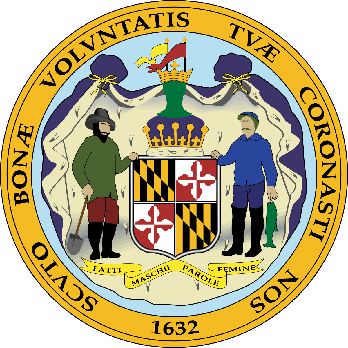
Of course, the coat of arms is not actually represented like it is on the flag. It is featured in its true form on the Seal of the State of Maryland. 

Seal_of_Maryland_(reverse).svg.png

This is the part that makes this flag stand out. US state flags often feature the state seal pasted on blue or white. These flags are called SOBs (Seals On Bedsheets), and there are 30 of them! Seriously! Look it up. I checked. And seal or no seal (not the game show), 38 state flags incorporate text! 

The flag of Maryland however features the seal’s strongest aspect front and center, as the whole flag. The colors are simple and bold. Red, yellow, black and white. And don’t you dare tell me “that’s four colors!” No it’s not. Black and white are not colors. That’s two. And what good colors at that. Red and white contrast really nicely, and black and yellow the same. 

The flag doesn’t feature any lettering, either. If the Maryland flag followed the general rules of state flag design, it would probably look something like this: 

MarylandFake1.jpg

or maybe even this:

MarylandFake.jpg

I know…ew.

Instead, the flag of Maryland looks like this:

2000px-Flag_of_Maryland.svg.png

Glorious and badass, simultaneously and at the same time. 

It’s actually a very European style of vexillography. A similar design process was used for the flag of Amsterdam, the most badass city flag in the world. 

So your kid can’t draw it. Fine. 

Hell, I probably can’t draw it. Fine. 

But this flag is distinct. No name tag needed. You can see it up close. You can see it from afar. And what a cool thing to see. Nothing about this flag is boring. 

But let’s look past the technicalities. What’s it like in the wild? 

This flag is a bold flag. And as an avid sports-aesthetic-noticer, I have seen this flag featured in various subtle and not-so-subtle field capacities on the field of play, as a form of state and/or civic pride. 

On the one hand, you have the sleeve patches featured on both the Orioles’ and Ravens’ uniforms.

022FD69B-A462-43DC-AA96-6AD3F1DF394F.JPG

Subtle, right? Nice little detail. What a cool way to acknowledge where you’re from! 

And on the other hand, you have the University of Maryland.

nehbfr1g56hgqzldanmt.jpg

Now, I get that the flag’s colors look a little strange on the Orioles’ orange. And I get that nothing looks good on purple because purple’s a shitty color. But the University of Maryland, with the flag they had, decided that was all they needed. They took an awesome color combination and created my favorite flag-based uniform ever. So distinct. So bold. It’s so much, yet so clean. The jersey shouldn’t even say “Maryland." We know who you are, UM. 

Here’s another one. I don’t know how many times I’ve seen this sticker:

md crab.jpg

Not just in Maryland, either. Everywhere. 

It’s a bit much for my taste, but that’s not the flag's fault. It has, after all, been forced into the tiny legs of a crab. Good luck with that. But the fact that this sticker pops up so much is a testament to the flag’s success. If Maryland had a shameful flag like those we discussed previously, their stickers would look like this:

MDCrab.jpg

Like every other sticker ever. Whatever. It’s been done. It’s boring. 

In the end, a good flag is one that is distinct and that inspires pride in its people. That is the job of a flag. In Maryland I see both. 

bs-fe-maryland-flag-confederate-20170803.jpg
1409d4218e70bb6306ba8309588f512c.jpg

That said, this is the line: 

17150412502_c37d0329ca_b.jpg

Don’t cross the line. 

Thursday 11.16.17
Posted by Baylor Watts
 

Here Are All of the Uniforms From the 2017 AUDL Season

Hey, I’m Baylor. I love sports. Specifically, I love baseball and Ultimate. Even more specifically, I have always been obsessed with athletics aesthetics. I grew up designing baseball jerseys on index cards, and as I grew older and began playing ultimate in high school, I applied my uniform obsession to the disc sport. In 2015, I started watching professional ultimate. As the sport continues to grow, I continue to watch its aesthetics develop. Now, with the AUDL championship weekend approaching, I thought it would be a great time to go over all of the AUDL’s many uniforms, good, bad, and ugly. So let’s get into it. 

The AUDL (American Ultimate Disc League) played its inaugural season in 2012 with eight teams. In April of 2017 it entered its 5th season, now encompassing 24 teams which scatter the continental United States and Canada. To give you an idea of what we’re working with, Ultimate uniforms are a set of shirt and shorts, loose-fitting to allow flexibility. The official uniform supplier of the AUDL is Boon Ultimate, who makes light and breathable uniforms, thanks to the process of jersey sublimation. Sublimation allows almost any image to be transferred into the very fabric of the apparel. Cool, right? 

Well…it is cool, it’s just made it possible for some teams to commit crimes of "uni-versal” proportion. From this moment on, this is my review of the field of 2017 AUDL kits. I tired to find pictures of the uniforms in action. For teams that didn’t have any good pictures, I just used the pictures they used in their stores. Sorry for the inconsistencies. Also, this is not in ranking-order. I’m going alphabetically. Starting…now!

Atlanta Hustle

edited+to+Dropbox-1277+-+Copy.jpg
edited+-3253.jpg

 That’s the home kit on the left, road on the right.

Honestly, I kinda like these. I am really not a fan of the color purple as a team color, but the use of purple here, setting off the black and the white alike, I think it looks cool. The number font is consistent, and the big, bold HUSTLE on the home kit’s chest is simple and intimidating. Well done. The red stripe on the road jersey is a nice touch as well. 

Austin Sol

Home left, road right.

I honestly can’t say too much about these. I love them. Blue and orange are great together. I love the orange stripes on the home sleeves and the blue road sleeves. A cool insignia has been appropriately adapted for play at home and on the road. I also want to add that the player on the left coordinated his socks and cleats very well. That’s unusual in ultimate. Nice touch.

Chicago Wildfire

Home left, road right.

The good: I love the Chicago flag on the sleeve. Every Chicago team should adorn a jersey or 3 with that beautiful flag. I actually like the font.. Looks like a fire and rescue font. Which makes some sense, given Chicago's history, fire-wise. Also, cool nod to the sears tower. Which brings us to the…um…"room for improvement” section. 

Wildfire should be the big word. But the way it sort of looks like “Wildfire Chicago” rubs me the wrong way. And like I said before, blue and orange are great colors together. But I kinda wish they were blue and red. The flag is blue and red, and so are the Cubs. I just think it would have been a nice nod to the hometown. But overall, this is still one of the better looks.  

Dallas Roughnecks

maxresdefault-6.jpg

Home left, road right. 

The home jersey this year are a huge improvement over last year’s, in my opinion. It’s still a lot going on, at least on the back. But at least it’s only two colors now. And honestly, the oil rig as a continuation of the homage to Texas’ oil history is a great addition. The road jerseys are similarly cool, keeping the chest graphic simple with a smaller oil rig on the front. Nice two color left sleeve. Generally speaking, you can’t go wrong with red, white and blue.

DC Breeze

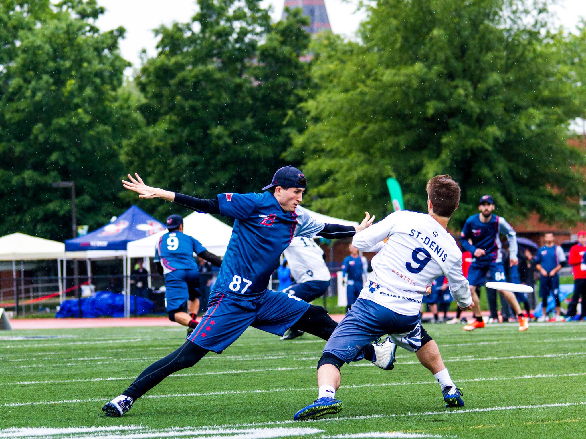
I do like these. They are a little bit much, with a whole back of lightly sublimated stars, and I think even on the front, judging by this photo of the road kit. But it’s not obnoxious by any means. And the shorts! These are some of my favorite shorts in the AUDL. There are two red lines that run down the left side (player’s left) of the jersey and the right side of the shorts. It’s not a straight line. It looks like a visual representation of the “breeze.” And on the shorts, 3 red stars complete the DC flag. Sweetly subtle. Again, DC. Red, white, blue. Very appropriate. Can’t go wrong. 

Detroit Mechanix

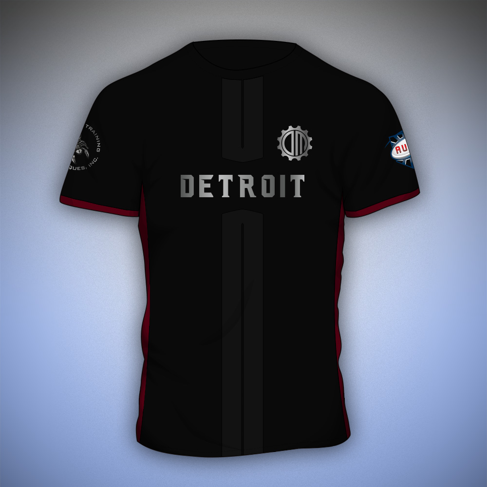
Okay, I honestly didn’t expect much from Motor City. Their logo always disappointed me a little bit and they’re really not that impressive as a team. But...that said, I was caught off guard when I found that, I like these! I don’t love the use of metallics on uniforms, but it’s Detroit! The home kit is a good nod to the city’s industry without being obnoxious. Same for the road kit. I dig the stripes, and I like that it remains a gray and white jersey with some badass blood-red underarm accents. Well played, Detroit. 

Indianapolis Alley Cats

As one of the only teams sporting true green, the Alley Cats are definitely different. I can’t totally get behind the logo. It seems like a little much, but other than that, the jerseys are refreshingly simplistic, featuring their full logo and player numbers on the front. Their home jersey looks like a classic t-shirt, white collar and cuffs, and the road kit is another classic t-shirt. A good ol’ raglan. I like it, and I hate to say it, but this kind of simplicity definitely stands out in the Ultimate uni-verse. 

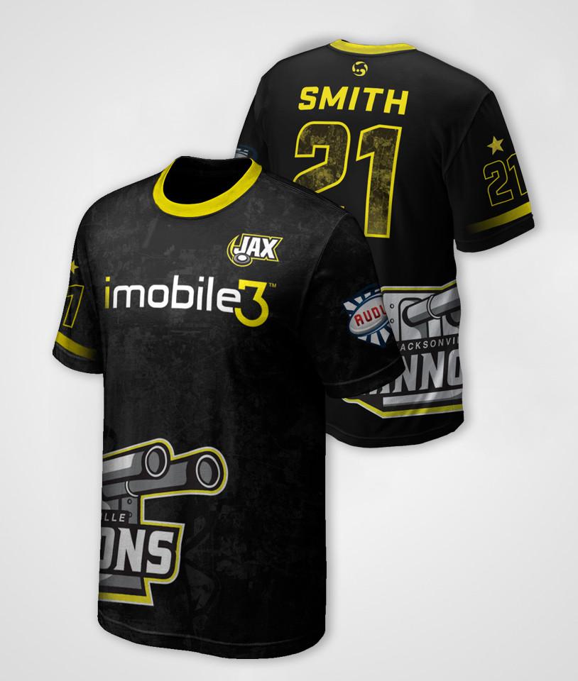
Jacksonville Cannons

Alright! This is my hometown team! I do favor them in gameplay, but I will not spare any complaints over this misdemeanor of a uniform. I really want to like these, and it’s hard to pinpoint why I don’t, but I’ll start with the collars and cuffs. The road kit features a black collar-cuffs combo. And it’s cool. So why does the home kit only get half of one yellow cuff?! It fades out under the arm for some reason. The road jersey features the Cannons’ primary logo front and center. Boom. That’s it. The home jersey, however, features the team's sponsor front and center. Fine. But wait! They just moved the primary logo to the side. That is the most awkward place to stamp your big clunky logo, Jax. But that wasn’t enough, so the little secondary “Jax” mark gets a chest appearance. It’s too much. 

Here comes my favorite part…

If you found yourself squinting and trying to make out some pattern over the entire jersey, you aren’t crazy. It’s there. That pattern, ladies and gentlemen, is a Satellite image of Jacksonville. At one point, I thought it was just the inside of the numbers on the back. I thought, “Cool touch.” Nope, It’s the whole damn thing. This is the danger of sublimation. With great power comes great responsibility. It’s just way too much, Jax. I yell because I care. Clean it up. 

Los Angeles Aviators

Thank you, Aviators, for restoring peace to the uni-verse. I love these. Red and black is iffy for me, but that home jersey is just the right combination of simple and interesting. Good bold font. Good size. The full-jersey “A” symbol is really cool on the home and away kits. It appears that the same shorts are worn at home and on the road, but I think that actually makes a lot of sense for them. LA is full of good uniforms and this one is no exception. 

Madison Radicals

This may just be my favorite uniform set. I’m usually not a fan of gradient use on uniforms, but something about the Radicals’ colors makes it a really solid design. And that logo is really powerful. I love the navy shorts to compliment the blue-to-acid green jersey. It’s killer. I am also a huge fan of white on white. So the road kit rocks. A big blue strike makes room on the sleeve for a big white TV number. The Radicals’ colors are just off enough to make them look really unique. No complaints. 

hat-player.png

I take that back. This hat is my one complaint. The design goes on the crown. Only the crown. This looks like an accident. Clean it up.

Minnesota Wind Chill

I can’t say I feel all that strongly about these. I used to, because the Wind Chill’s home jersey used to be a lot cooler. The overall composition of the home jersey is still pretty decent, but that gray is weirdly blue. The home jersey used to be the three lines in the logo going down the jersey off-center, and the M was placed on top of them at chest-height. Number on front was pretty much the same placement. There were no weird half pinstripes. I don’t know, I just liked that better. #bringitback 

On the other hand, this road jersey is too much and too little at the same time. For how much is going on on this jersey, it lacks detail. I like too preach simplicity, so I’m sorry to say I don’t like it. I wish they would try writing “Minnesota" or "Wind Chill" on it somewhere instead of pasting the logo front and center. There’s a lot of opportunity in black, grey, and white. Keep at it, Minnesota. 

Montréal Royal

This is another personal favorite. Nothing says “Royal” like a sash across the chest. Muted navy and orange look great together and navy all the way down looks great. The crest on the home kit makes it look like a soccer jersey, but somehow better! Montréal’s wordmark is cool, so the away kit is also quite good. White jerseys with navy shorts was a good call. Sometimes white on white doesn’t work out. My only complaint is that bird. I like that bird, but I wish they would remove it from the side of the away jersey. It’s not awful now, I just think it would be cleaner and more consistent sans bird. 

Nashville Nightwatch

Okay, so the home kit is decent. All black would have been too much, so the gray pattern is a nice addition. Otherwise they kinda just plopped their primary logo right on the middle of the jersey. But it’s a good logo (definitely an improvement over their old logo), so whatever. On the other hand, their road kit. I saw the Nightwatch when they played my Cannons in Jacksonville on opening day, and I found myself gawking over these. What a good looking road jersey. White, with a subtle gray “Nashville” placed above a bold, red, “Nightwatch.” And shorts to match. Great front number placement and size and font. It’s simple and beautiful and I love it. If only they got the credit they deserved by winning, say, a single game. The Nightwatch are 0-14. 

New York Empire

The home jersey used to be a bona fide tragedy. The New York City skyline was raised up from hem to chest in black, gray, and lime green. “Empire” graced the front above the buildings. It was bad. This is good. They shed the cartoon New York and replaced it with a simple “Empire.” Brilliant. And above that, but not too high, player numbers and the crest make their subtle appearance. Great font for the number on back of that home jersey. Very blue jays. I do though, wish they used the same number font at home and on the road. Probably the one from the road kit if I had to choose, since it’s the one that would look cool on both. The away kit is equally awesome. Simple and classic, as is New York’s specialty. I can’t say I’m generally a fan of pinstripes ever, but it’s very John Lennon and very Yankees and I respect that. 

Ottawa Outlaws

So the home and away kits are pretty much the same, save for the color tweaking. So my complaints will cover both. The whole jersey looks like an adaptation of a Microsoft Powerpoint template with a big-ass horse head. I don’t mind the horse head as a logo, but I don’t think it should get such a big presence on the jersey. I don’t know where the horse should go…not there. Just...I don’t know. It looks very fabricated and lazy. That should cover it. 

Philadelphia Phoenix

Okay, we made it to my least favorite set of jerseys. It is my least favorite set of jerseys because it perfectly showcases the gravity of the mistakes that can be made through sublimation. On the home jersey, a fire burns from the bottom of the jersey to the top. The Phoenix’s word mark, in a font reminiscent of a comic book, appears on the chest. It’s an okay logo. All in all, whatever. The home kit’s not great. But is nowhere near as bad as the road kit seen on the right. The road kit features a giant cartoon phoenix, rising above the Philadelphia skyline, emitting pinkish-red rays to the edges of the jersey. The logo is placed on the chest again. The sleeves, despite the torso train-wreck, remain untouched. It just looks too cheesy, even for a town known for its cheesesteaks. I love Philadelphia. It’s a beautiful city, all decked out in red, white and blue. And its sports teams are no exceptions. At least the Phillies and the Sixers aren’t. So you can sense my frustration with a team dressed as tackily as the Phoenix. 

Pittsburgh Thunderbirds

Pittsburgh! Pittsburgh. I love this city. Pittsburgh is known for its sports, and Pittsburgh’s sports are known for being so very Pittsburgh. So, naturally, the Thunderbirds followed suit. Unlike the Phoenix, the T-birds embraced the hometown colors, the distinctive yellow and black worn by the Penguins, Steelers, and Pirates. Good for you, T-birds. Other than that, I think the jerseys are rather unexciting. The logo is good, but it’s nothing special, so its chest presence doesn’t add much to the kits. This is what most college ultimate jerseys look like. The jersey is pretty much the same home and away. One black, one white. What is yellow remains yellow on both. Overall, can’t complain. They’re not awful. They just don’t stand out to me. 

Raleigh Flyers

The Raleigh Flyers are an excellent team, going 13-1 so far this season. They beat my cannons twice by only a point this season. I can look past that enough to say that I do like their kits. The home kit is especially cool. The bright red and light blue is a killer color combo, and the logo is really cool too. I would venture to say it could maybe be a tad larger on the chest. The blue portion of the left sleeve is the Raleigh skyline, which I definitely looks better on the sleeve than on the butt of the away jersey. The front of the away jersey features the same Flyers’ logo as the home kit, just on white. Additional thoughts on these kits: I think it looks great when players wear blue socks, especially light blue. And I like the white shorts, but I really don’t think the “R” logo needs to be that big. Keep it subtle. 

San Diego Growlers

The Growlers mascot, though it shows no appearance on the jerseys, is a greyhound. The Growlers’ did a beautiful job on their home jerseys of acknowledging this, giving the whole kit a brown-infused-gray color. It looks really sweet. The red band across the chest accentuates the team name quite nicely. The “Growlers” is bold and easy to read and it looks great. I love the cuffs in red. And the hems of the shorts. That’s subtlety done right. The away jersey. Same deal. Same red band. Same red cuffs. Same font. Glad they kept the gray shorts. All around solid look. Go San Diego. 

San Fransisco Flame Throwers

Hey Philly! San Fransisco figured it out. This is how you do fire. I love these jerseys. These are in my top 3, league-wide. The geometric fire pattern that burns on the chest is simple, but equally exciting. The bottom of the jerseys remain blank, which looks so good. The away kit is the a best case scenario of white on white, and for that matter, the home kit is the best case scenario for black on black. The seal on the chest is a strong one, and player numbers are emblazoned on the chest in Helvetica. Simple. Bold. All around great look. Well done, San Fransisco. It’s a masterpiece. 

San Jose Spiders

Another solid look. The spider in their logo has a sort of robotic look to it, and the “Spiders” font reflects that. So the shield shape being a little different goes right along with their branding. It makes sense. The home kit. One yellow stripe. Black on black. Simple numbering. Sweet. Looks strong. Away jersey is an adaptation of the home kit, so same same. Looks good. A strong team with a strong look. Nice work, Spiders.

Seattle Cascades

This is another favorite of mine. The two tone blue jersey is just barely noticeable from a distance, but it really adds to the jersey. The Cascades’ word mark is a good one. It’s presence on the home chest makes for an ideal look. It’s the perfect combination of sublimation’s capabilities and a sense of simplicity. I dig it. The away jersey is alright. I think “Seattle” is a little too wide to be pasted so high up and directly above Casey the Sasquatch. That said, I love the Casey logo. I love that Sasquatch is the visual representation for the Cascades. The blue side and shoulder accents come from the pattern of Casey’s fur. Which is cool. Apart from a slight problem with composition on the away jersey, I think the Cascades look good. It’s a well-constructed set of uniforms. 

Toronto Rush

Toronto is home to Canada’s second pro ultimate team. While I think it is appropriate that Montreal’s team gets that navy-and-orange, European look, I’m glad that one team chose to wear red. However, I can’t say that I love their look. The home jersey is just a tad too much. I think the “TR” logo is okay, but I don’t like the “rush” logo hardly at all. It’s too early 2000s. It looks too much like an energy drink logo. I think the weird gold bursts are weird. However, I do like the away jersey. I wish there were red shorts to go with it, but I think the small “TR” logo looks nice on the white, with a reasonably sized front number below it. The away look is better, but that wasn’t a feat by any means. There’s work to be done here, Toronto, but it’s possible. Get rid of your energy drink logo. Try and use that amazing national flag to your advantage. I’ll be back to check on you in a few years.

Vancouver Riptide

VancRiptide Home.jpg

And finally, The Vancouver Riptide. The Riptide is Canada’s third team, but Vancouver is basically part of the Pacific Northwest, so the blue and green seems appropriate. And boy does it look good on you, Riptide. These kits, with their vertical, woven striping, are reminiscent of a soccer team, or maybe even basketball in a way. The “Riptide” word mark is really solid, and so is the logo, so I’m glad they both show up on the home kit. “Riptide” is placed sensibly on the chest, perpendicular to the striping, and the logo is placed on the shorts. (This is a good size for a shorts logo, Raleigh) A different weaving pattern crosses the chest of the road jersey, and is equally good-looking. A blue vertical stripe runs down the sleeve and side and becomes the blue shorts. Good job there. Can’t say too much, Vancouver. You look good. 


So you see what I mean. Ultimate uniforms are pretty cool when designed appropriately. They're probably closer to soccer that anything, but they are in a way becoming a uniform style in and of themselves. The patterns and the lightweight clothing and the presence of sublimation are all characteristic of the ultimate uni-verse. Sublimation is providing a platform for betterment and advancement of uniforms, but really is a tool that must be handled with care and respect.

That's the whole field of AUDL uniforms for the 2017 season, and that’s all I have to say about that. Overall, I think the ultimate uni-verse could use some work, but it’s definitely a good sign that there are teams like Seattle and San Fransisco and San Diego pushing it in the right direction. Be sure to watch out for these teams in the coming month, as we approach Championship Weekend in Montreal, August 26-27. 

Tuesday 08.01.17
Posted by Baylor Watts
 

Powered by Squarespace.